Making of “Tales of Mystery And Confusion” with Clemens Ascher

“In this series, I show mystical figures from a vaguely remembered tale performing cryptic gestures and ominous rituals.” – Clemens Ascher.

Collaboration with Clemens is always an extraordinary journey. In this series, retouching combines CGI with fine art.

The concept was to have the look of a 2D collage, with fabric and other props produced in 3D and then combined with the figures which were shot in the studio.

As CG artists, normally we are purely concerned with getting an image as close to reality as possible. In this case, Clemens wanted a combination of photo-realism with perspectives that are just a little ‘off’, to give a surreal, disjointed feel. This is a fine line to walk in post-production, and an exciting challenge for us, with a huge amount of creative freedom and input. The details of our renderings and lighting were very much an integral part of the artistic process.

For instance, the floors for some images are correct in 3D space for shadows etc., but their texture is applied almost like a 2D collage, without much depth in the perspective depth happening. “Amber Queen”, below, is a very good example for this effect.

Conceptually this references medieval art with its odd sizes and perspectives, which is also referred to in some of the props we created like armour and shoes. These tensions of opposites are present in many aspects of the series, producing the effect of strangeness that Clemens wanted.

Technical Process:

We began each image by setting up a CG space as a match for the camera and model, for shadows, indirect light and reflections.

Clemens provided a sketch for each figure, and from this, we began to block out shapes, exploring forms and thinking about the silhouette. With every element, we started with reality.

“Amber Queen”

Here for instance, for the armoured dress, we looked at real armour, how it’s made and jointed, and how this would wear – before working with the shapes to give it uniquely unreal, skewing asymmetry.

Substance Painter gave us the possibility to create a realistic, used appearance for our materials, and we then used our virtual lighting rig, adjusting the original settings to make them work for the completely different properties of armour.


We had previously developed our own system for making realistic amber with flaws, shapes and colour all generated from our own observations. Using this ultra-realistic natural material to make a hat was typical of the tension between reality and unreality that Clemens was looking for.

“EXORCIZE”

We generated the amber again for this image and also a mysterious mountain range to set the figures in.

For “EXORCIZE” we used Houdini again for the pink hair, inputting geometrical parameters to produce a true natural feel – a great opportunity to push this software in an unusual environment.

“MELANCHOLY”

We built this tutu in a completely different way, as if this was a real life fashion project with the correct crinoline construction underneath it. We tested this with different materials such as lace, bringing our machines very close to their computational limit!

Working like a fashion designer would, we tried many different fabrics to get the rich, ruffled texture that we wanted, to complement the severe geometric shape of the skirt itself. Here you can see two other options in lace and chiffon.

With the final decision to use a light tulle, we achieved the affect we wanted: a solid block of fabric with a light, foamy texture, that tension of opposites working again to destabilise perception. Zoom in for the details that make the difference

Grading

With the series complete in structure, the files went from Germany to Recom Farmhouse London for Creative Supervisor Kate Brown to fine tune the compositing from all the different applications, and colour grade the images.

For the grade, she took inspiration once again from paintings – ranging from medieval icons to renaissance masterpieces in oils. A simplified, painterly treatment, giving the sense of collage whilst bringing detail out of the blacks, and enhancing the sense of archetypal forms. Here’s a view of the full process from original sketch to finished image.

We’ll leave you with some thoughts from Clemens Ascher:

“Seeing these naturally raises some crucial questions:
What is their message?
Can they protect us?
Will they guide us in our search for salvation?
And can we even trust them? – Probably not.
But you can worship them, let them take important decisions or cure your agonised bodies – good luck! “


See the whole series on our site here and on Behance here

Photographer: Clemens Ascher
Creative Director: Kate Brown / Recom Farmhouse London
CGI Artists: Sebastian Schierwater, Richard Jenkinson, Dennis Brinkmann / Recom Stuttgart
Post Artists: Jonas Braukmann, Stephanie O’Connor / Recom Berlin

Making of “A Hypnotic Journey” with Alessandra Kila

“Through the mechanical and perpetual movements of diamonds, malachite, tourmaline and pearls the viewer is taken from a rational state of mind to a trance-like hallucination where both image and colours react to the altered state of mind. Jewels are real, but they are also a sub-conscious reality that exist as a state of desire in our mind.”

– Alessandra Kila


Follow Alessandra Kila into a world of hypnotic machines that enthrall through their perpetual movement. Working closely with our London studio, a triptych of full CGI videos evolved, each featuring a piece of Chanel jewellery functioning like an entrancing device: a necklace oscillates like a pendulum, a ring repeats the pattern of a spinning machine and a bracelet echoes the circular movements of a gyroscope.

How we made it:

Starting with a moodboard of references drawn from architecture, fashion, textures and art,  Alessandra Kila created a world with a highly  curated and very distinct slant on Art Deco.

The jewellery was recreated in CGI from the  original pieces, with great attention paid to the texturing of surfaces and the properties of the precious stones. Detail is everything…

For the animations Alessandra and our 3D artist Anna Toropova tested and observed the movements in real life before imitating them on screen. For instance, repeatedly dropping and filming a pearl or a ring, then replicating its motion in CGI.

At times that meant working frame by frame to achieve the most realistic flow. Clay renders below show the careful, precise progress of  the work.

The simplified set design and colours subtly harmonise with the Art Deco style of the jewellery pieces.

The sets are particularly inspired by ideas around vitrines and the display of precious objects.

Glitchy psychedelic interruptions jolt the viewer from their reverie, creating dramatic dissonances.

Initial tests show wild experimentation for colours that have just the right qualities.

The final colour grading and sound design pull all the pieces together – blending these two aesthetic worlds.


View all three pieces together on our website.


Director: Alessandra Kila
Concept, Look Development: Alessandra Kila
Full CGI Motion and Stills: Recom Farmhouse
Editor: Zoe Alexandrou
Music Composer and Sound Designer: Manuel Pinheiro
VFX: Alessandra Kila
Compositing: Felix Baesch / Recom Farmhouse
Modelling: Tanguy Koutouan / Recom Farmhouse
Texturing and Shading: Joe Carney / Recom Farmhouse
Animatics and Lighting: Anna Toropova / Recom Farmhouse
Color Grading: Christoph Bolten / Recom Farmhouse
Still Retouching: Aljaz Bezjak, Maria Luisa Calosso / Recom Farmhouse

Making Of “Haze”

Project: Haze Creative Director: Kate Brown CGI Artist: Marvin Lübke Post Production: Kate Brown Aljaz Bezjak

Tomek Makolski collaborates with Recom Farmhouse to create full CGI staging for an evocative slice of 80s Vegas life.Bored but ultra-glamorous, she stalks her enclosed world of a motel in purest yellow. The images are drenched in intense pastel yellows and blues, but below the surface gloss of this sunny palette, there’s tension in these moments out of time, a sense of detachment, drift and dream.

Why this solitary intermission in her life, just killing time?

Subtle cues in the setting hint at an ambivalent celebrity and faint, atmospheric menace.

A Look Behind The Scenes

We were delighted to collaborate with Tomek to bring this idea to life.

The model photography was already complete, so we began with her character, working collaboratively to imagine a setting for her that would be right for her aesthetic…stylish but faintly gritty.

With a huge variety of movements to choose from, we chose those that contributed to the atmosphere we are trying to build – strongly defined poses with interesting shapes – and built an environment for this character to inhabit.

A sense of place is central to creating realistic environments, even though we didn’t want to without being too explicit about the location. We settled on suburban Las Vegas as having the right combination of motel style that we needed to stage the scenes.

Searching to find a sweet spot between surrealism and reality, we created a realistic motel, and turned every part of yellow to add a jolt of unreality, as well as giving a stylishly minimal feel to the detailed environments.

Smaller cues such as her face in the poster on the wall, or in the magazines ,add to an almost subliminal sense of displacement.

It’s also a time capsule of 80s elements. The styling of the model had already been carefully considered – her sun visor, big hair channeling Faye Dunaway, the cut of her swimsuit – so we chose props such as the vending machine to enhance the feeling of a shift in time.

Tomek already had a moodboard of references, and we expanded on this with contemporary details for all elements – whether integral parts of the set like breeze blocks or railing designs, to objects like towers of cards and an oversized phone.Items like a baseball bat or broken glass contributed to the faint sense of unease, and the feeling of depth and difference in focus enhances the dream-like feeling of the series.

Technical Process

We wanted to use a different, more stripped back workflow on this project. The images were begun in Unreal, the CGI finished in Blender, and then composited and graded in Capture One.

Everything is CGI in the images except the model and the sun lounger – and in fact we we recreated the sun lounger in CGI for a seamless match between the real and the virtual.

We began the project in Unreal, so we could adjust all the elements of the set with maximum interactivity. In Unreal, we matched the lighting and angles of the CGI environment to the original model shots, and tested colours and props at lightning speed.

Instant feedback at high fidelity allowed us to be adventurous in art direction…moving the model around the set without the need to wait for renders. It’s a great platform for experimentation and taking chances.


With the creative decisions made, we moved the project into Blender for the last stage.

This meant we could render the final CGI environments in a high enough quality that we could go directly to compositing and colour grading – an interesting exercise for us to see how far we could push pure CGI.

Finally, we added the model in via Capture One with minimal colour work – just minimal grading to balance her correctly into the CGI backplate.


We hope you enjoy the way this collaboration blurs the line between fantasy and reality…we’re proud to have made the dream real.

Soundtrack:  We recommend Bananarama and Fun Boy Three: Our Lips Are Sealed

See the entire project on www.recomfarmhouse.com or Behance

Photographer: Tomek Makolski

Concept: Tomek Makolski & Michal Sek

Model: Ola Kowal / modelplus

Photographer’s Assistant: Adam Gocel

Make-up Artist: Adrian Swiderski

Hair artist: Patryk Nadolny
Stylist: Milena Bekalarska

Studio, equipment and support: Studio Tęcza
Creative Director: Kate Brown / Recom Farmhouse
CGI Artist: Marvin Lübke / Recom Farmhouse
Post Artists: Kate Brown, Aljaz Bezjak / Recom Farmhouse

News: Ralph Mecke for Best Fashion

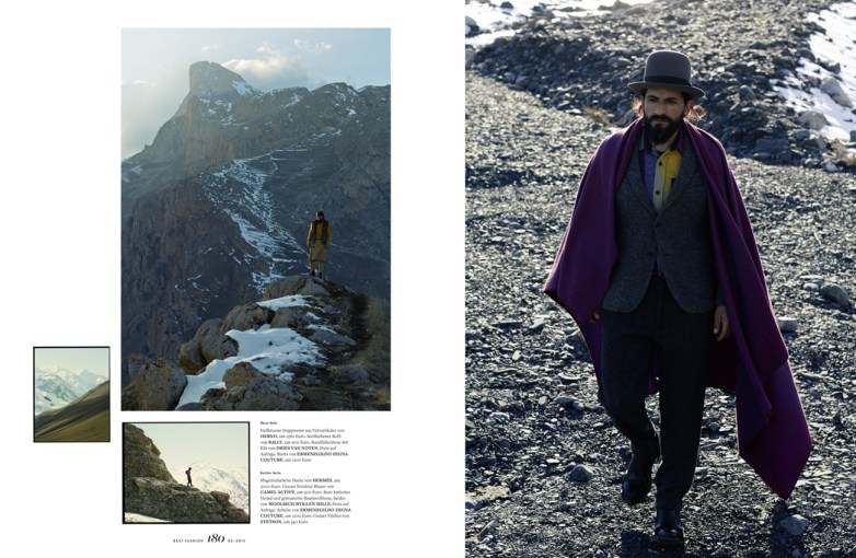
Fashion photographer Ralph Mecke has shot this beautiful editorial for Best Fashion magazine.
Ralph’s images are shot on large format negative. You can just feel the film quality of these images; the grain, the tones, the depth of field is just incredible! We scanned the images in our studio in Stuttgart and fine tuned the colours.

BF_0215_Mountain Prophet 1.korr.indd

CREDITS:

Photographer: Ralph Mecke
Production: Ylmaz Aktepe
Post Artist: Thomas Saalfrank/ Recom

News : Monica Menez

Jewellery story “Touched For The Very First Time” was photographed by Monica Menez using jewellery from designers Vanessa Baroni, Jasmina Jovy and Galen Guld. To enhance the pastels and soft look of the images we created these multi coloured backgrounds with Monica.  Hope you enjoy the subtle nuances of the series!

Monica Menez retouched by Recom

Read more

Making of : Tears

BLINKK_Aura_Tear

One day we were called by Damien De Blinkk called us with a rather unusual request: can you make a girl cry? While being a questionable task in the real world, in the virtual world this turned out to be a fun little project! See the making-of below, using ZBrush to model the tear, Maya/Vray for lighting & rendering and bringing it all together and adding those bloodshot eyes in Photoshop finished it off.

tear_zBrush_01

Screenshot of the tear in zBrush.

tear_maya_01

Screenshot of the tear in Maya.

Tear_Gif

Making of: from the 3D model of the tear to the final image retouched in Photoshop.

FinalCloseUp

Close-up of the final image. Click to enlarge.

The concept for the campaign has since changed, but we were very happy with our result as it turned out to be a fun little project! Click on the image above and see by yourself!

CREDITS:

Photography: BLINKK
Making of tear: Recom Farmhouse
CGI artist: Richard Jenkinson
CGI director: Christoph Bolten
Retouching of tear: Christoph Bolten

News : Zwischenwelten by Ralph Mecke

Check out this crazy beautiful editorial, shot by Ralph Mecke on large format colour negative. It is inspired by the world of Francis Bacon and takes you to some dark and beautiful places inside the human soul. Our team in Stuttgart scanned the images, making sure to keep the analogue feeling of the negative whilst showing a peculiar palette of colours for this eccentric world of unusual beings.

14-09_BILD_03_v9_edit01_s_k
14-09_Ralph_Mecke_Zwischenwelten_Layout1
14-09_BILD_11_v9q_s_k
14-09_BILD_04_v6_edit03_k
14-09_MOT_13_v8_edit01_s_k
14-09_BILD_10_v8_k
14-09_BILD_08_v9_edit03_k
14-09_BILD_05_v5_edit02_k
14-09_MH_Nr02_b04_obenlinks_BILD02_v13_edit02_editnew4
14-09_BILD_12_v9_edit01_s_k
14-09_BILD_07_v6b_edit01_k

CREDITS:

Client: Best Fashion
Photography: Ralph Mecke
Post Artis: Thomas Saalfrank
Production: Yilmaz Aktepe